custom-cover-arrow

Coty Virtual Makeup Studio

Augmented reality makeovers

Augmented reality makeovers

Augmented reality makeovers

Augmented reality makeovers

Augmented reality makeovers

The first app-free makeover experience with integrated eCommerce functionality for global beauty group Coty, to allow customers to virtually try on makeup products and view step-by-step application instructions, on their smartphone or desktop device. The first brand to be chosen from the group was New York-based makeup and skincare brand, CoverGirl.

The first app-free makeover experience with integrated eCommerce functionality for global beauty group Coty, to allow customers to virtually try on makeup products and view step-by-step application instructions, on their smartphone or desktop device. The first brand to be chosen from the group was New York-based makeup and skincare brand, CoverGirl.

The first app-free makeover experience with integrated eCommerce functionality for global beauty group Coty, to allow customers to virtually try on makeup products and view step-by-step application instructions, on their smartphone or desktop device. The first brand to be chosen from the group was New York-based makeup and skincare brand, CoverGirl.

The first app-free makeover experience with integrated eCommerce functionality for global beauty group Coty, to allow customers to virtually try on makeup products and view step-by-step application instructions, on their smartphone or desktop device. The first brand to be chosen from the group was New York-based makeup and skincare brand, CoverGirl.

The first app-free makeover experience with integrated eCommerce functionality for global beauty group Coty, to allow customers to virtually try on makeup products and view step-by-step application instructions, on their smartphone or desktop device. The first brand to be chosen from the group was New York-based makeup and skincare brand, CoverGirl.

Coty's goal was to increase conversion and average order value, by providing the customer with everything they need to feel confident in making a purchase decision, particularly important for cosmetics as these are generally non-returnable. This work went on to form a white label platform on top of which the 'My Makeup Artist' experience for Max Factor and Macy's were built.

Coty's goal was to increase conversion and average order value, by providing the customer with everything they need to feel confident in making a purchase decision, particularly important for cosmetics as these are generally non-returnable. This work went on to form a white label platform on top of which the 'My Makeup Artist' experience for Max Factor and Macy's were built.

Coty's goal was to increase conversion and average order value, by providing the customer with everything they need to feel confident in making a purchase decision, particularly important for cosmetics as these are generally non-returnable. This work went on to form a white label platform on top of which the 'My Makeup Artist' experience for Max Factor and Macy's were built.

Coty's goal was to increase conversion and average order value, by providing the customer with everything they need to feel confident in making a purchase decision, particularly important for cosmetics as these are generally non-returnable. This work went on to form a white label platform on top of which the 'My Makeup Artist' experience for Max Factor and Macy's were built.

Coty's goal was to increase conversion and average order value, by providing the customer with everything they need to feel confident in making a purchase decision, particularly important for cosmetics as these are generally non-returnable. This work went on to form a white label platform on top of which the 'My Makeup Artist' experience for Max Factor and Macy's were built.

🥇 Winner of the Glossy Award for ‘Best use of New Platform by a Brand’, 2018 (CoverGirl)

🥇 Winner of The Drum DADI Award for ‘Technical Innovation’, 2019 (Max Factor)

🥇 Winner of the Webby Award for ‘Fashion, Beauty and Lifestyle’, 2020 (Macy's)
 

🥇 Winner of the Glossy Award for ‘Best use of New Platform by a Brand’, 2018 (CoverGirl)

🥇 Winner of The Drum DADI Award for ‘Technical Innovation’, 2019 (Max Factor)

🥇 Winner of the Webby Award for ‘Fashion, Beauty and Lifestyle’, 2020 (Macy's)
🥇 Winner of the Glossy Award for ‘Best use of New Platform by a Brand’, 2018 (CoverGirl)

🥇 Winner of The Drum DADI Award for ‘Technical Innovation’, 2019 (Max Factor)

🥇 Winner of the Webby Award for ‘Fashion, Beauty and Lifestyle’, 2020 (Macy's)
🥇 Winner of the Glossy Award for ‘Best use of New Platform by a Brand’, 2018 (CoverGirl)

🥇 Winner of The Drum DADI Award for ‘Technical Innovation’, 2019 (Max Factor)

🥇 Winner of the Webby Award for ‘Fashion, Beauty and Lifestyle’, 2020 (Macy's)
🥇 Winner of the Glossy Award for ‘Best use of New Platform by a Brand’, 2018 (CoverGirl)

🥇 Winner of The Drum DADI Award for ‘Technical Innovation’, 2019 (Max Factor)

🥇 Winner of the Webby Award for ‘Fashion, Beauty and Lifestyle’, 2020 (Macy's)
Covergirl Cover

The Challenge

The Challenge

The Challenge

The Challenge

The Challenge

Factors such as time, distance from store and the awkwardness of removing current makeup to try on products whilst being out and about, are some of the reasons CoverGirl's customers gave us for wanting to shop online. Their main hesitations in doing so centred around not being able to return a mismatched shade.

Factors such as time, distance from store and the awkwardness of removing current makeup to try on products whilst being out and about, are some of the reasons CoverGirl's customers gave us for wanting to shop online. Their main hesitations in doing so centred around not being able to return a mismatched shade.

Factors such as time, distance from store and the awkwardness of removing current makeup to try on products whilst being out and about, are some of the reasons CoverGirl's customers gave us for wanting to shop online. Their main hesitations in doing so centred around not being able to return a mismatched shade.

Factors such as time, distance from store and the awkwardness of removing current makeup to try on products whilst being out and about, are some of the reasons CoverGirl's customers gave us for wanting to shop online. Their main hesitations in doing so centred around not being able to return a mismatched shade.

Factors such as time, distance from store and the awkwardness of removing current makeup to try on products whilst being out and about, are some of the reasons CoverGirl's customers gave us for wanting to shop online. Their main hesitations in doing so centred around not being able to return a mismatched shade.

Our design and engineering teams at Beamly worked with AR company Holition to ease the barriers that online beauty retailers face in accurately representing their products to customers, and the difficulties that customers experience in determining whether a product is suitable for them.

Our design and engineering teams at Beamly worked with AR company Holition to ease the barriers that online beauty retailers face in accurately representing their products to customers, and the difficulties that customers experience in determining whether a product is suitable for them.

Our design and engineering teams at Beamly worked with AR company Holition to ease the barriers that online beauty retailers face in accurately representing their products to customers, and the difficulties that customers experience in determining whether a product is suitable for them.

Our design and engineering teams at Beamly worked with AR company Holition to ease the barriers that online beauty retailers face in accurately representing their products to customers, and the difficulties that customers experience in determining whether a product is suitable for them.

Our design and engineering teams at Beamly worked with AR company Holition to ease the barriers that online beauty retailers face in accurately representing their products to customers, and the difficulties that customers experience in determining whether a product is suitable for them.

How might we...

Business Goal

Improve conversion by supporting customers in their purchase decision?

Improve conversion by supporting customers in their purchase decision?

Improve conversion by supporting customers in their purchase decision?

Improve conversion by supporting customers in their purchase decision?

Improve conversion by supporting customers in their purchase decision?

Business Goal

Increase basket size through providing recommendations?

Increase basket size through providing recommendations?

Increase basket size through providing recommendations?

Increase basket size through providing recommendations?

Increase basket size through providing recommendations?

Customer Goal

Support customers in finding the products most suitable for them?

Support customers in finding the products most suitable for them?

Support customers in finding the products most suitable for them?

Support customers in finding the products most suitable for them?

Support customers in finding the products most suitable for them?

Discovery and Research

Prior to creating this product, our team had been working with CoverGirl to undertstand their customer's needs.

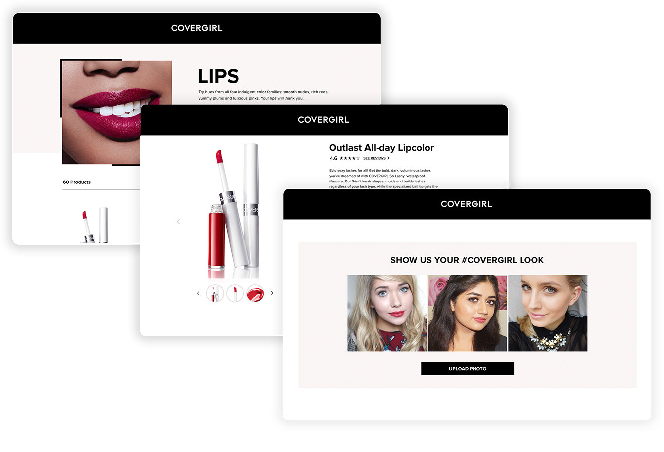
Customers told us that they wanted clear insights into each product's packaging, texture, application and appearance on a diverse range of skin tones, which we had been incrementally optimising through changes to the photography, product information, including application tips on PDPs and bringing in user generated content to increase social proof and allow customers to see the products on relatable people, who hadn't had the help of a professional make up artist.

We had seen some improvement in conversion, but customers still expressed uncertainty around whether the products would complement their appearance.

Recognising this challenge, we explored the concept of a virtual try-on service, inspired by the familiarity users had with filters on platforms such as Snapchat.

Through surveying, we found that the perceived quality of services available at the time was low, with customers citing both the effort involved in downloading a new app and device incompatibility as the main barriers to entry.

To address this need, we brought on Holition, who had prior experience in developing app-versions of this service. Our UX team worked to tailor the interface and user journey for a browser-based experience, whilst our engineering focused on eCommerce integration and performance to ensure a seamless and reliable experience.

cgrl-previous-work

Image: Incremental enhancements of product information on the CoverGirl site

star-black

Onboarding and Perceived Performance

Embedding this service within the CoverGirl site rather than a downloaded app presented a performance challenge, as rather than relying on locally stored data, the content must be accessed quickly enough so as not to significantly impair the experience on a slower connection. 

Embedding this service within the CoverGirl site rather than a downloaded app presented a performance challenge, as rather than relying on locally stored data, the content must be accessed quickly enough so as not to significantly impair the experience on a slower connection. 

Embedding this service within the CoverGirl site rather than a downloaded app presented a performance challenge, as rather than relying on locally stored data, the content must be accessed quickly enough so as not to significantly impair the experience on a slower connection. 

Embedding this service within the CoverGirl site rather than a downloaded app presented a performance challenge, as rather than relying on locally stored data, the content must be accessed quickly enough so as not to significantly impair the experience on a slower connection. 

Embedding this service within the CoverGirl site rather than a downloaded app presented a performance challenge, as rather than relying on locally stored data, the content must be accessed quickly enough so as not to significantly impair the experience on a slower connection. 

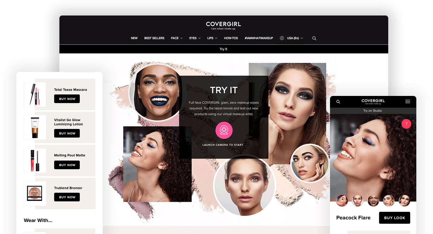
On the landing page, we experimented with different CTA styles to encourage the customer to overcome the barrier of needing to provide access to the browser to launch their camera. The best performing version utilised colour, iconography and animation to capture the customer's attention.

On the landing page, we experimented with different CTA styles to encourage the customer to overcome the barrier of needing to provide access to the browser to launch their camera. The best performing version utilised colour, iconography and animation to capture the customer's attention.

On the landing page, we experimented with different CTA styles to encourage the customer to overcome the barrier of needing to provide access to the browser to launch their camera. The best performing version utilised colour, iconography and animation to capture the customer's attention.

On the landing page, we experimented with different CTA styles to encourage the customer to overcome the barrier of needing to provide access to the browser to launch their camera. The best performing version utilised colour, iconography and animation to capture the customer's attention.

On the landing page, we experimented with different CTA styles to encourage the customer to overcome the barrier of needing to provide access to the browser to launch their camera. The best performing version utilised colour, iconography and animation to capture the customer's attention.

Launch button

Constructing the preview

Constructing the preview

Constructing the preview

Constructing the preview

The best performing version of the launch button, using colour, iconography and animation to capture the user's attention and encourage them to launch the experience by providing access to their camera.

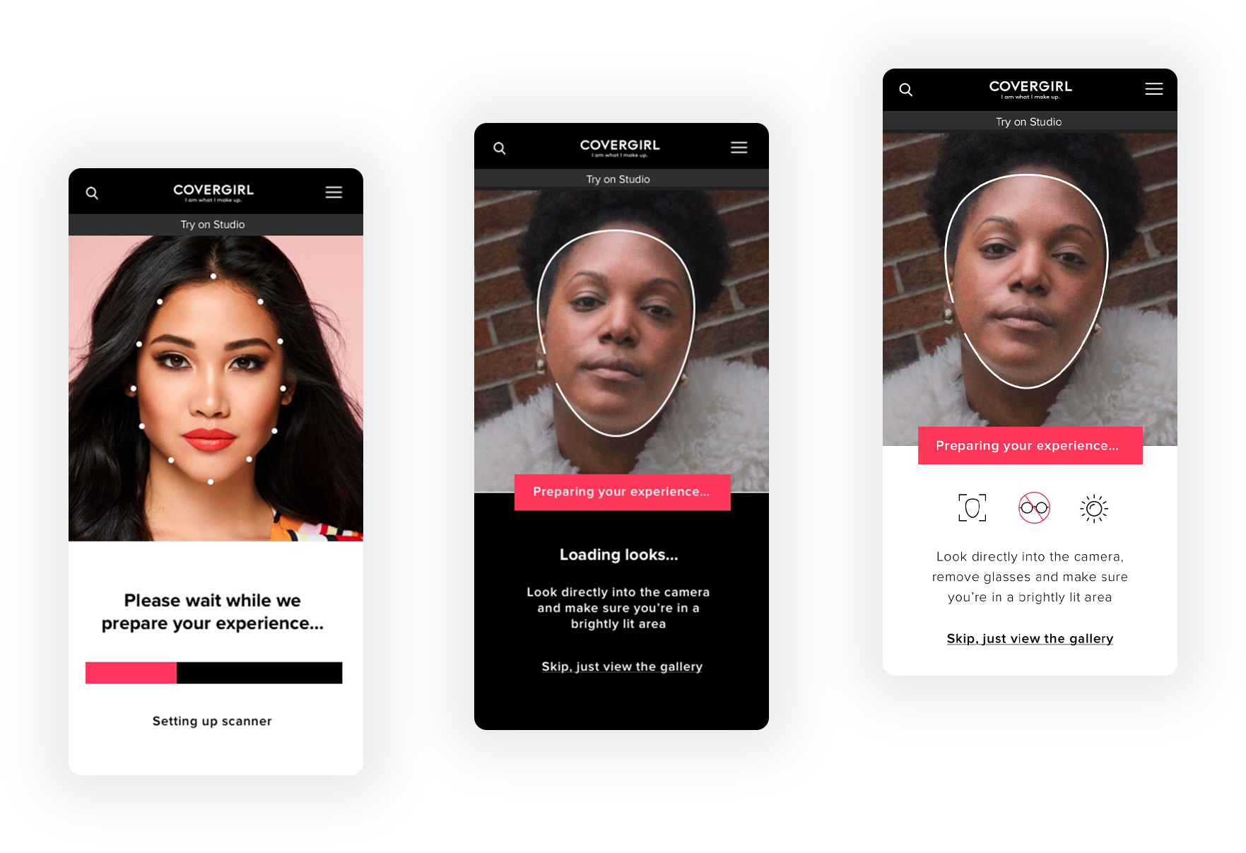
For an optimal experience, the user must be facing the camera and standing in reasonable lighting conditions, to avoid issues with facial tracking.

These could be clownish-looking, misaligned appearance in very bright lighting, or the camera not recognising the user at all if they're in a very dark room. 

To manage expectations and allow the user to ensure their surroundings were suitable, the final design included usage instructions with supporting iconography. 

To keep users engaged, we enabled the camera with a face-scanning animation before the experience had fully loaded, as this proved to be less frustrating than a loading bar.

This also performed better than using a model shot, as it was clearer to the user that they would be able to see the looks on their own face. For particularly slow connections or camera detection failures, a model shot was used which directed users to a page where they could view the looks without try-on.

CoverGirl loading screens

Image: Displaying the user's face rather than a model shot whilst the experience loaded kept users more engaged and loading times less noticeable.

star-black

Fallback experience and error states

We optimised for the most common iOS and Android smartphones at the time, and in line with CoverGirl's current and targeted user demographic.

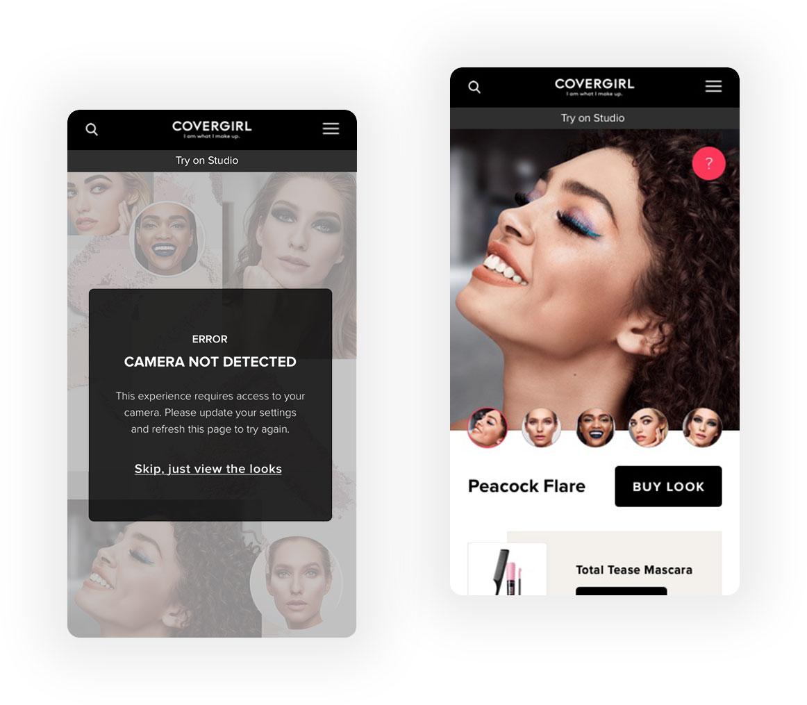
If the system detected that user was running an older browser or operating system or was experiencing low connectivity or camera issues, they were provided with clear error messaging along with troubleshooting instructions. 

If their loading speed was too slow, they were asked to try again when connected to wi-fi or in a higher connectivity area, and for camera issues to update their settings and refresh the page to reload the experiance and try again.   

To avoid a dead end and still allow the customer to shop, the error page also provided a link to a shoppable lookbook where they could browse and view the looks, and purchase without trying them on.

fallbalck

Image: Clear error messaging was provided if the experience could not be loaded, along with a link to a static page which showed the looks on models.

star-black

Before/and After

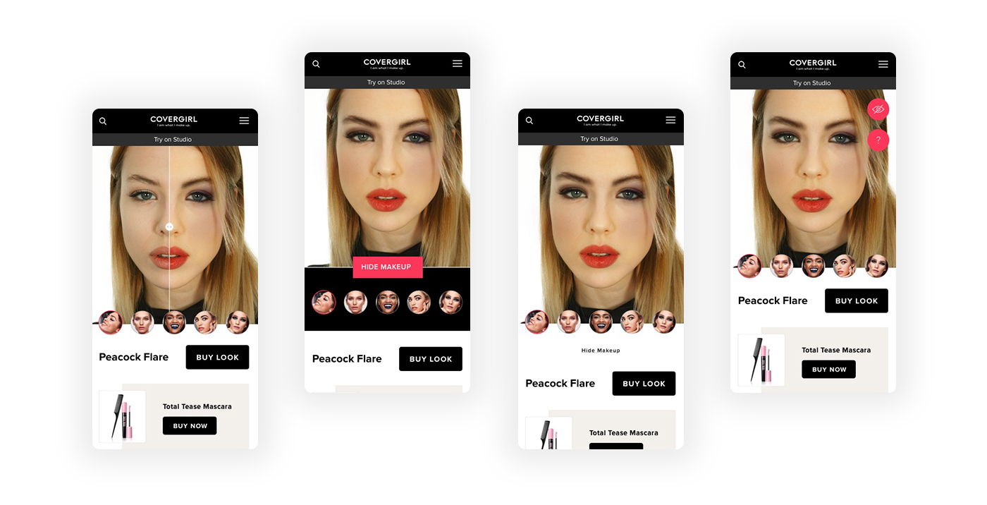
To allow the user to easily compare their appearance before and after, we experimented with a slider to show/hide makeup. For the MVP launch we scaled this back to a button. The most intuitive position to place this button seemed to be below the thumbnails, but this pushed the product recommendations too far down the page on most mobile screens.

To allow the user to easily compare their appearance before and after, we experimented with a slider to show/hide makeup. For the MVP launch we scaled this back to a button. The most intuitive position to place this button seemed to be below the thumbnails, but this pushed the product recommendations too far down the page on most mobile screens.

To allow the user to easily compare their appearance before and after, we experimented with a slider to show/hide makeup. For the MVP launch we scaled this back to a button. The most intuitive position to place this button seemed to be below the thumbnails, but this pushed the product recommendations too far down the page on most mobile screens.

To allow the user to easily compare their appearance before and after, we experimented with a slider to show/hide makeup. For the MVP launch we scaled this back to a button. The most intuitive position to place this button seemed to be below the thumbnails, but this pushed the product recommendations too far down the page on most mobile screens.

To allow the user to easily compare their appearance before and after, we experimented with a slider to show/hide makeup. For the MVP launch we scaled this back to a button. The most intuitive position to place this button seemed to be below the thumbnails, but this pushed the product recommendations too far down the page on most mobile screens.

We experimented with adding an icon and moving this above the thumbnails, but this was still too prominent and detracted from the main CTA to shop the look. Ideally we'd have continued testing and iterating as the feedbak was mixed, but for launch we placed this in the top right corner with the info button, as it would allow us to easily update to the slider when possible.

We experimented with adding an icon and moving this above the thumbnails, but this was still too prominent and detracted from the main CTA to shop the look. Ideally we'd have continued testing and iterating as the feedbak was mixed, but for launch we placed this in the top right corner with the info button, as it would allow us to easily update to the slider when possible.

We experimented with adding an icon and moving this above the thumbnails, but this was still too prominent and detracted from the main CTA to shop the look. Ideally we'd have continued testing and iterating as the feedbak was mixed, but for launch we placed this in the top right corner with the info button, as it would allow us to easily update to the slider when possible.

We experimented with adding an icon and moving this above the thumbnails, but this was still too prominent and detracted from the main CTA to shop the look. Ideally we'd have continued testing and iterating as the feedbak was mixed, but for launch we placed this in the top right corner with the info button, as it would allow us to easily update to the slider when possible.

We experimented with adding an icon and moving this above the thumbnails, but this was still too prominent and detracted from the main CTA to shop the look. Ideally we'd have continued testing and iterating as the feedbak was mixed, but for launch we placed this in the top right corner with the info button, as it would allow us to easily update to the slider when possible.

Hide Makeup

Image: Evolution of the 'Hide Makeup' interaction

star-black

Increasing the basket size

At the time, CoverGirl products were only purchasable through beauty stockists, rather than directly from the brand. To allow customers to shop directly from this experience, the brand  partnered with ChannelAdvisor to provide links on each product page so users could be directed to their preferred retailer to place their order.

Walmart was chosen as the preferred eCommerce partner for this project. Offering only one retailer allowed us to simplify the purchase path, and have more control over the shopping bag and onward journey. 

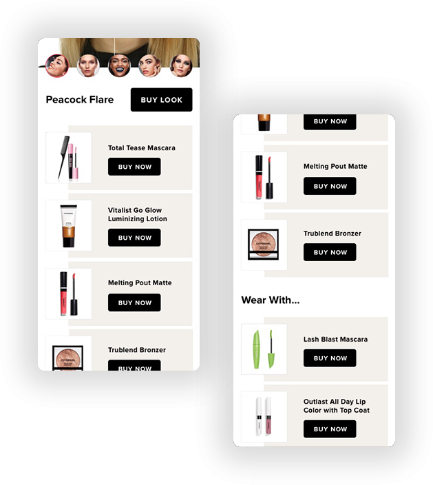
Once a look was selected, users could add all items to their bag, or mix and match individual products from multiple looks. Users could also exclude products from the look by editing the shopping bag.

To provide users with an alternative if they either already owned or didn't like one or more of the featured products, the final section of the page included a curated edit of recommended products under 'Wear With'. This also served to create an onward journey if the featured products had sold out.

Try on - Purchase

Image: Featured and recommended products for an onward journey

star-black

Outcome and learnings

The experience was available to the US market during Spring 2018, after which the technology and learnings were used as a starting point for another team’s work on Max Factor’s Virtual Makeup Artist web app.

By strengthening the customer's understanding of each product and how these work together as full looks, we aimed to increase conversion, which doubled for users shopping via the experience versus browsing products on the main site, along with an increase in the bag size.


The experience was available to the US market during Spring 2018, after which the technology and learnings were used as a starting point for another team’s work on Max Factor’s Virtual Makeup Artist web app.

By strengthening the customer's understanding of each product and how these work together as full looks, we aimed to increase conversion, which doubled for users shopping via the experience versus browsing products on the main site, along with an increase in the bag size. 

From a customer perspective, we learned that being able to virtually try on looks gave users a deeper understanding of product suitability, but for added confidence they'd have preferred a personalised experience based on their physical features and style, rather than the same looks being available to all.

The project was featured in industry press, and won a Glossy Award, for ‘Best use of New Platform by a Brand’ in 2018.

Project-Info-LightProject-Info-LightProject-Info-LightProject-Info-LightProject-Info-LightProject-Info-LightProject-Info-Light

Client

CoverGirl

CoverGirl

CoverGirl

Agency

Beamly

Beamly

Beamly

Date

2018

2018

2018

My Role

Discovery and research
Competitor analysis
Low-fidelity wireframes and prototypes
High-fidelity designs and asset creation
Usability testing and validation
Design workflow management
Providing direction to the design team

Discovery and research
Competitor analysis
Low-fidelity wireframes and prototypes
High-fidelity designs and asset creation
Usability testing and validation
Design workflow management
Providing direction to the design team

Discovery and research
Competitor analysis
Low-fidelity wireframes and prototypes
High-fidelity designs and asset creation
Usability testing and validation
Design workflow management
Providing direction to the design team

Discovery and research
Competitor analysis
Low-fidelity wireframes and prototypes
High-fidelity designs and asset creation
Usability testing and validation
Design workflow management
Providing direction to the design team

Discovery and research
Competitor analysis
Low-fidelity wireframes and prototypes
High-fidelity designs and asset creation
Usability testing and validation
Design workflow management
Providing direction to the design team

Collaborators

Beamly design and engineering teams
Holition design and engineering teams
CoverGirl brand marketing team

Beamly design and engineering teams
Holition design and engineering teams
CoverGirl brand marketing team

Beamly design and engineering teams
Holition design and engineering teams
CoverGirl brand marketing team

Beamly design and engineering teams
Holition design and engineering teams
CoverGirl brand marketing team

Beamly design and engineering teams
Holition design and engineering teams
CoverGirl brand marketing team

Contact

star-white-1

Work Enquiries

Drop me an email to discuss your project

save for later

Design mentorship

© ZARA DREI 2024

Back to top Arrow
View