custom-cover-arrow

Luxury Global eCommerce Checkout

Global checkout for luxury retailers

Global checkout for luxury retailers

Global checkout for luxury retailers

Global checkout for luxury retailers

Global checkout for luxury retailers

A localisable, scalable, omnichannel Demandware checkout, providing a seamless experience between the online and physical stores.

This checkout solution was created with the global luxury customer with a busy schedule in mind, providing the flexibility and service levels these customers expect.

A localisable, scalable, omnichannel Demandware checkout, providing a seamless experience between the online and physical stores.

This checkout solution was created with the global luxury customer with a busy schedule in mind, providing the flexibility and service levels these customers expect.

A localisable, scalable, omnichannel Demandware checkout, providing a seamless experience between the online and physical stores.

This checkout solution was created with the global luxury customer with a busy schedule in mind, providing the flexibility and service levels these customers expect.

A localisable, scalable, omnichannel Demandware checkout, providing a seamless experience between the online and physical stores.

This checkout solution was created with the global luxury customer with a busy schedule in mind, providing the flexibility and service levels these customers expect.

A localisable, scalable, omnichannel Demandware checkout, providing a seamless experience between the online and physical stores.

This checkout solution was created with the global luxury customer with a busy schedule in mind, providing the flexibility and service levels these customers expect.

The checkout was designed to be used by the Labelux group of luxury retailers including Jimmy Choo, Bally and Belstaff, as well as external brands such as Versace. The checkout was distributed as a white-label service with the ability to add branding at a granular level, for a personalised solution which intergrates seamlessly with each brand's aesthetic.
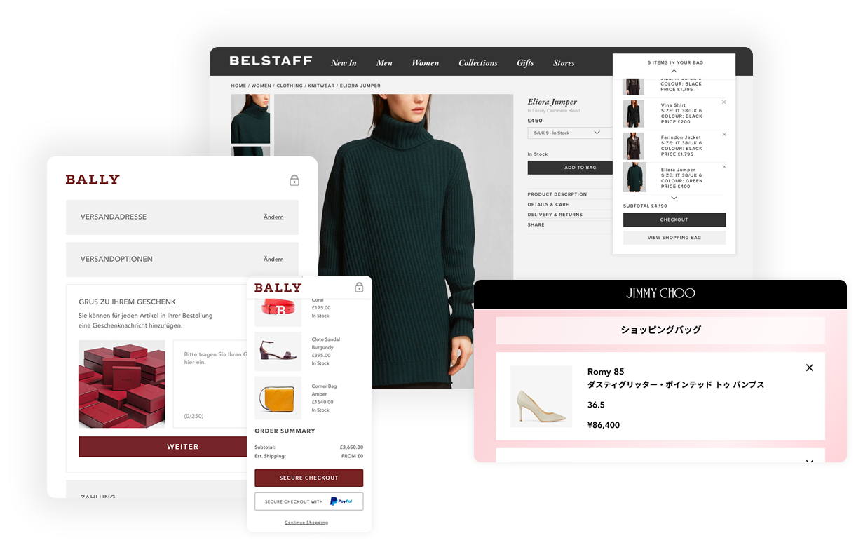
 

The checkout was designed to be used by the Labelux group of luxury retailers including Jimmy Choo, Bally and Belstaff, as well as external brands such as Versace. The checkout was distributed as a white-label service with the ability to add branding at a granular level, for a personalised solution which intergrates seamlessly with each brand's aesthetic.
 

The checkout was designed to be used by the Labelux group of luxury retailers including Jimmy Choo, Bally and Belstaff, as well as external brands such as Versace. The checkout was distributed as a white-label service with the ability to add branding at a granular level, for a personalised solution which intergrates seamlessly with each brand's aesthetic.
 

The checkout was designed to be used by the Labelux group of luxury retailers including Jimmy Choo, Bally and Belstaff, as well as external brands such as Versace. The checkout was distributed as a white-label service with the ability to add branding at a granular level, for a personalised solution which intergrates seamlessly with each brand's aesthetic.
 

The checkout was designed to be used by the Labelux group of luxury retailers including Jimmy Choo, Bally and Belstaff, as well as external brands such as Versace. The checkout was distributed as a white-label service with the ability to add branding at a granular level, for a personalised solution which intergrates seamlessly with each brand's aesthetic.
 

Global ecommerce checkout

The Challenge

The Challenge

The Challenge

The Challenge

The Challenge

Luxury brands have the advantage of strong creative and storytelling to drive sales, but as shoppers give high value items more consideration, a clear, simple and reassuring checkout process is vital to conversion.

Labelux's in-house agency provided eCommerce services to the Labelux group of luxury retailers, with each brand offering a different combination of delivery, gift and payment options.

Our team’s goal was to bring together the checkout flows and refine the purchase process whilst incorporating omnichannel initiatives to provide a harmonious experience with stores, whilst accounting for region-specific legal requirements. We also considered the group’s roadmap, and included preliminary designs for services we planned to fully research and roll out in future.

Our team’s goal was to bring together the checkout flows and refine the purchase process whilst incorporating omnichannel initiatives to provide a harmonious experience with stores, whilst accounting for region-specific legal requirements. We also considered the group’s roadmap, and included preliminary designs for services we planned to fully research and roll out in future.

Our team’s goal was to bring together the checkout flows and refine the purchase process whilst incorporating omnichannel initiatives to provide a harmonious experience with stores, whilst accounting for region-specific legal requirements. We also considered the group’s roadmap, and included preliminary designs for services we planned to fully research and roll out in future.

Our team’s goal was to bring together the checkout flows and refine the purchase process whilst incorporating omnichannel initiatives to provide a harmonious experience with stores, whilst accounting for region-specific legal requirements. We also considered the group’s roadmap, and included preliminary designs for services we planned to fully research and roll out in future.

Our team’s goal was to bring together the checkout flows and refine the purchase process whilst incorporating omnichannel initiatives to provide a harmonious experience with stores, whilst accounting for region-specific legal requirements. We also considered the group’s roadmap, and included preliminary designs for services we planned to fully research and roll out in future.

How might we...

Business Goal

Decrease basket abandons, to increase conversion?

Decrease basket abandons, to increase conversion?

Decrease basket abandons, to increase conversion?

Decrease basket abandons, to increase conversion?

Decrease basket abandons, to increase conversion?

Business Goal

Provide a frictionless experience tailored for the global markets of all brands in the group?

Provide a frictionless experience tailored for the global markets of all brands in the group?

Provide a frictionless experience tailored for the global markets of all brands in the group?

Provide a frictionless experience tailored for the global markets of all brands in the group?

Provide a frictionless experience tailored for the global markets of all brands in the group?

Business Goal

Reinforce the link between physical stores and the website?

Reinforce the link between physical stores and the website?

Reinforce the link between physical stores and the website?

Reinforce the link between physical stores and the website?

Reinforce the link between physical stores and the website?

Research and information gathering

The first task was to review the existing checkout and collecting screenshots of all possible journeys for each brand, along with examples of each automated email sent to the customer at various points in the purchase and returns cycle.

The first task was to review the existing checkout and collecting screenshots of all possible journeys for each brand, along with examples of each automated email sent to the customer at various points in the purchase and returns cycle.

The first task was to review the existing checkout and collecting screenshots of all possible journeys for each brand, along with examples of each automated email sent to the customer at various points in the purchase and returns cycle.

The first task was to review the existing checkout and collecting screenshots of all possible journeys for each brand, along with examples of each automated email sent to the customer at various points in the purchase and returns cycle.

The first task was to review the existing checkout and collecting screenshots of all possible journeys for each brand, along with examples of each automated email sent to the customer at various points in the purchase and returns cycle.

Our platform partner, Demandware, also provided a detailed site audit. Reviewing these, along with tracking data which showed common drop off points and the most common issues reported to customer services, allowed us to identify and prioritise areas of improvement.

Our platform partner, Demandware, also provided a detailed site audit. Reviewing these, along with tracking data which showed common drop off points and the most common issues reported to customer services, allowed us to identify and prioritise areas of improvement.

Our platform partner, Demandware, also provided a detailed site audit. Reviewing these, along with tracking data which showed common drop off points and the most common issues reported to customer services, allowed us to identify and prioritise areas of improvement.

Our platform partner, Demandware, also provided a detailed site audit. Reviewing these, along with tracking data which showed common drop off points and the most common issues reported to customer services, allowed us to identify and prioritise areas of improvement.

Our platform partner, Demandware, also provided a detailed site audit. Reviewing these, along with tracking data which showed common drop off points and the most common issues reported to customer services, allowed us to identify and prioritise areas of improvement.

star-black

A holistic approach

Considering all entry points to the checkout rather than focusing solely on the checkout ensured all touchpoints across the site were updated to support any new features, and able to guide the customer through a coherent purchase path. 

Considering all entry points to the checkout rather than focusing solely on the checkout ensured all touchpoints across the site were updated to support any new features, and able to guide the customer through a coherent purchase path. 

Considering all entry points to the checkout rather than focusing solely on the checkout ensured all touchpoints across the site were updated to support any new features, and able to guide the customer through a coherent purchase path. 

Considering all entry points to the checkout rather than focusing solely on the checkout ensured all touchpoints across the site were updated to support any new features, and able to guide the customer through a coherent purchase path. 

Considering all entry points to the checkout rather than focusing solely on the checkout ensured all touchpoints across the site were updated to support any new features, and able to guide the customer through a coherent purchase path. 

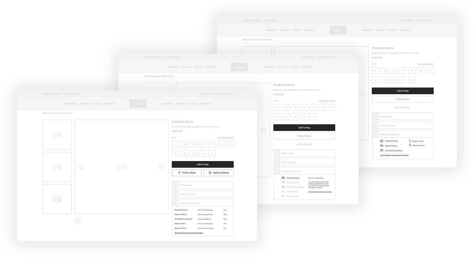
For example, new delivery options were clearly communicated to the user on the product detail and shopping bag pages as well as during checkout, to inform and assure customers, and encourage them to complete their purchase.

For example, new delivery options were clearly communicated to the user on the product detail and shopping bag pages as well as during checkout, to inform and assure customers, and encourage them to complete their purchase.

For example, new delivery options were clearly communicated to the user on the product detail and shopping bag pages as well as during checkout, to inform and assure customers, and encourage them to complete their purchase.

For example, new delivery options were clearly communicated to the user on the product detail and shopping bag pages as well as during checkout, to inform and assure customers, and encourage them to complete their purchase.

For example, new delivery options were clearly communicated to the user on the product detail and shopping bag pages as well as during checkout, to inform and assure customers, and encourage them to complete their purchase.

Shipping options

Image: Wireframe iterations on displaying shipping options on the PDP. The final version involved adding icons to the main calls to action so they stand out against all the information, and displaying prices and lead times for all delivery options to improve comprehension at a glance.

star-black

An uninterrupted flow

Especially in the case of higher value products, our data showed that customers were more likely to compare and eliminate multiple options in their shopping bag before deciding on a smaller number of items to purchase.

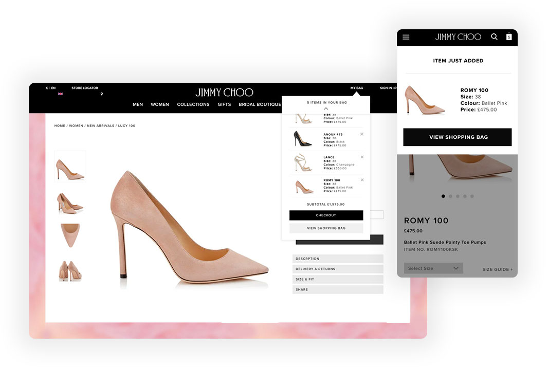
Adding a mini cart dropdown which appears when a user adds a product to their bag, or interacts with the shopping bag icon, allows users to quickly view and edit their choices without having to load another page.

On mobile devices, we found that a full summary in a large overlay was more jarring an experience than loading the shopping bag page to see more, so for smaller screens only the latest product added appears in the dropdown. 

Once the customer is ready to proceed to checkout, the header is replaced with a streamlined, checkout-specific version which removes distraction and focuses the user on the tasks required to complete their purchase.

Mini Cart

Images: mini cart on the Jimmy Choo checkout

star-black

A tailored experience

Each brand had already built up a loyal following of in-store customers, who expect a similar level of personalisation when shopping on the website, and the flexibility to accommodate their busy schedules.

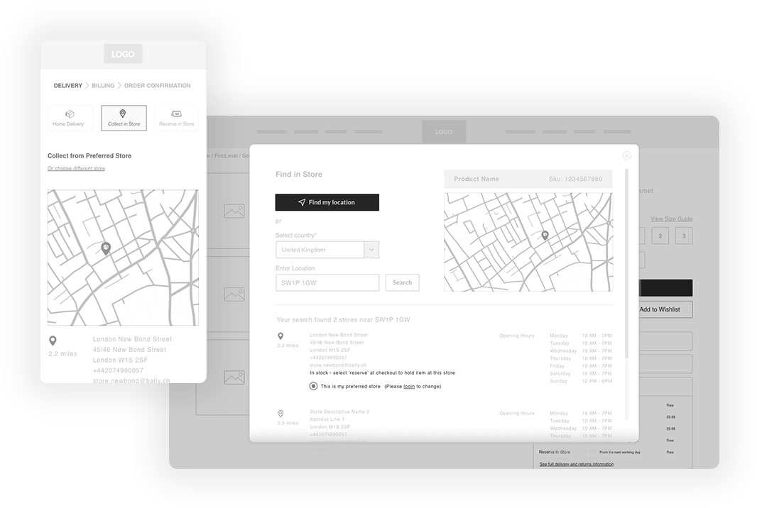
Providing options for users to check the stock levels of products and set their preferred store allow for a more seamless online and offline experience. 

As well as having the products delivered to their chosen address, the customer could also choose to check stock and reserve items in their size to try on at their most convenient Bally showroom, pay online and collect in person, have items delivered internationally or send gifts to multiple addresses from one checkout session.

As well as having the products delivered to their chosen address, the customer could also choose to check stock and reserve items in their size to try on at their most convenient Bally showroom, pay online and collect in person, have items delivered internationally or send gifts to multiple addresses from one checkout session.

As well as having the products delivered to their chosen address, the customer could also choose to check stock and reserve items in their size to try on at their most convenient Bally showroom, pay online and collect in person, have items delivered internationally or send gifts to multiple addresses from one checkout session.

As well as having the products delivered to their chosen address, the customer could also choose to check stock and reserve items in their size to try on at their most convenient Bally showroom, pay online and collect in person, have items delivered internationally or send gifts to multiple addresses from one checkout session.

As well as having the products delivered to their chosen address, the customer could also choose to check stock and reserve items in their size to try on at their most convenient Bally showroom, pay online and collect in person, have items delivered internationally or send gifts to multiple addresses from one checkout session.

Check stock in store

Image: wireframe for the Collect in Store option

star-black

Barriers to conversion

Our data showed that the login page was a common dropoff point. With most of the group’s site visitors being new rather than returning customers, it was important provide an onward journey if the customer was in a rush or hadn’t built up enough trust in the brand yet to part with their data. 

Our data showed that the login page was a common dropoff point. With most of the group’s site visitors being new rather than returning customers, it was important provide an onward journey if the customer was in a rush or hadn’t built up enough trust in the brand yet to part with their data. 

Our data showed that the login page was a common dropoff point. With most of the group’s site visitors being new rather than returning customers, it was important provide an onward journey if the customer was in a rush or hadn’t built up enough trust in the brand yet to part with their data. 

Our data showed that the login page was a common dropoff point. With most of the group’s site visitors being new rather than returning customers, it was important provide an onward journey if the customer was in a rush or hadn’t built up enough trust in the brand yet to part with their data. 

Our data showed that the login page was a common dropoff point. With most of the group’s site visitors being new rather than returning customers, it was important provide an onward journey if the customer was in a rush or hadn’t built up enough trust in the brand yet to part with their data. 

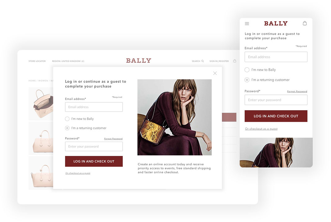
Aiming to balance the business goals of increasing marketing reach and building up a single customer view with providing the user with a quick and easy way to check out, a small guest checkout link was added below the main call to action, along with copy to highlight the benefits of creating an account.

Aiming to balance the business goals of increasing marketing reach and building up a single customer view with providing the user with a quick and easy way to check out, a small guest checkout link was added below the main call to action, along with copy to highlight the benefits of creating an account.

Aiming to balance the business goals of increasing marketing reach and building up a single customer view with providing the user with a quick and easy way to check out, a small guest checkout link was added below the main call to action, along with copy to highlight the benefits of creating an account.

Aiming to balance the business goals of increasing marketing reach and building up a single customer view with providing the user with a quick and easy way to check out, a small guest checkout link was added below the main call to action, along with copy to highlight the benefits of creating an account.

Aiming to balance the business goals of increasing marketing reach and building up a single customer view with providing the user with a quick and easy way to check out, a small guest checkout link was added below the main call to action, along with copy to highlight the benefits of creating an account.

Login

Image: an early option of the login as a popup - our hypothesis was that users would prefer this rather than waiting for a page to load, but users on the whole assumed it was an email signup popup and closed it without reading. The mobile view shows the static page version.

star-black

Payment and security

Placing clear information across the site to highlight delivery options and pricing, accepted payment methods, the returns policy and customer care details, ensures that customers feel supported and confident during the checkout process. 

Adding the word 'secure' to the checkout button along with a verification badge as the user enters the secure payment area reassures users concerned about entering their card details, especially when making high-value transactions.

The payment section was designed to be flexible in order to accommodate familiar payment methods and delivery options per locale, to ensure users are presented with an experience they are comfortable with.

For example, at the time paying after delivery via Klarna had the largest market share in Germany so it was placed at the top of the list. The checkout could also accommodate alternate payment types not offered in the UK such as cash on delivery, preferred in China.

star-black

Localised for the global customer

As well as additional payment options, each section of the checkout template could be adapted to meet each region's legal requirements and customer expectations.

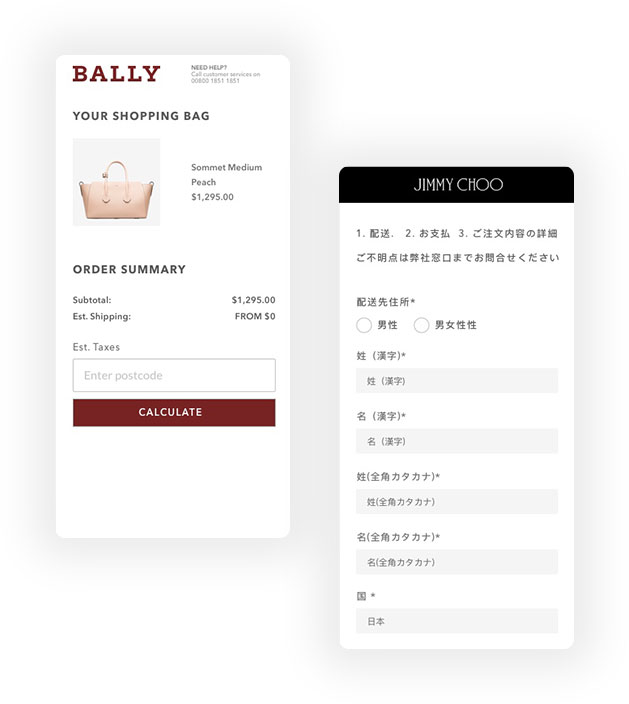
Tax is not included in US pricing, so to reduce the cart abandonment rate for the US market, a tax calculator appears on the shopping bag page so the user can keep track of any additional costs before they reach payment. 

Forms were optimised using an autofill service in multiple languages, with the ability to alter the layout of each form to accommodate each locale’s specific address format. For example, as well as adding a 'State' and 'Zip Code' vs Post Code option for the US market, the Japanese site displayed both Kanji and Katakana input fields to reduce cognitive load for customers who are accustomed to interacting with online forms in this way.

Forms were optimised using an autofill service in multiple languages, with the ability to alter the layout of each form to accommodate each locale’s specific address format. For example, as well as adding a 'State' and 'Zip Code' vs Post Code option for the US market, the Japanese site displayed both Kanji and Katakana input fields to reduce cognitive load for customers who are accustomed to interacting with online forms in this way.

Forms were optimised using an autofill service in multiple languages, with the ability to alter the layout of each form to accommodate each locale’s specific address format. For example, as well as adding a 'State' and 'Zip Code' vs Post Code option for the US market, the Japanese site displayed both Kanji and Katakana input fields to reduce cognitive load for customers who are accustomed to interacting with online forms in this way.

Forms were optimised using an autofill service in multiple languages, with the ability to alter the layout of each form to accommodate each locale’s specific address format. For example, as well as adding a 'State' and 'Zip Code' vs Post Code option for the US market, the Japanese site displayed both Kanji and Katakana input fields to reduce cognitive load for customers who are accustomed to interacting with online forms in this way.

Forms were optimised using an autofill service in multiple languages, with the ability to alter the layout of each form to accommodate each locale’s specific address format. For example, as well as adding a 'State' and 'Zip Code' vs Post Code option for the US market, the Japanese site displayed both Kanji and Katakana input fields to reduce cognitive load for customers who are accustomed to interacting with online forms in this way.

localisation

Image: Tax calculator for the US market and customised form fields for the Japanese site.

star-black

Outcome and learnings

The Labelux team built and launched the checkout as a template with configurable components, so that each brand could quickly and easily tailor the options to the services they offer, without the overhead of maintaining needing to 5 different checkout builds. This improved the efficiency of new feature rollouts and for changes to services to be updated reactively during peak season.

The team also received positive feedback from the brands' global teams and indirectly from the user via customer services.

Ideally, we'd have been able to run some in-person sessions with users before the design phase, but as the budget and scope didn't allow for this, we engaged in guerilla testing with brand employees within the target demographic whose roles sat outside of the digital space, asking them to complete tasks using prototypes, for an unbiased view to help us iterate and validate during the design process.

Updates to the checkout went live in stages and, so that we could use live data to inform further refinements to the flow. We didn't have the traffic to run split tests with statistical significance, so by releasing features separately we could monitor that specific change, and quickly revert if we noticed any negative impacts.

Feedback from the tech team and engagement with the store services tools indicated that we had met our goals of simplifying maintenance and linking up online and instore, though a lesson learned is that I'd have liked more access to the data to make like-for-like comparisons to understand if exactly which features had the most impact on our goals of increasing conversion and reducing basket abandonment.

Project-Info-LightProject-Info-LightProject-Info-LightProject-Info-LightProject-Info-LightProject-Info-LightProject-Info-Light

Client

Bally, Belstaff, Jimmy Choo, Versace

Bally, Belstaff, Jimmy Choo, Versace

Bally, Belstaff, Jimmy Choo, Versace

Bally

Bally, Belstaff, Jimmy Choo, Versace

Agency

Labelux

Labelux

Labelux

Labelux

Labelux

Date

Date

2016

2016

2016

2016

2016

My Role

Discovery and research
Competitor analysis
Stakeholder presentations

Low-fidelity wireframes and prototypes
High-fidelity designs and asset creation
Usability testing and validation

Discovery and research
Competitor analysis
Stakeholder presentations

Low-fidelity wireframes and prototypes
High-fidelity designs and asset creation
Usability testing and validation

Discovery and research
Competitor analysis
Stakeholder presentations

Low-fidelity wireframes and prototypes
High-fidelity designs and asset creation
Usability testing and validation

Discovery and research
Competitor analysis
Low-fidelity wireframes and prototypes
High-fidelity designs and asset creation
Usability testing and validation
Design workflow management
Providing direction to the design team

Discovery and research
Competitor analysis
Stakeholder presentations

Low-fidelity wireframes and prototypes
High-fidelity designs and asset creation
Usability testing and validation

Collaborators

Labelux design, production and engineering teams
Bally digital team
Belstaff digital team
Jimmy Choo digital team

Labelux design, production and engineering teams
Bally digital team
Belstaff digital team
Jimmy Choo digital team

Labelux design, production and engineering teams
Bally digital team
Belstaff digital team
Jimmy Choo digital team

Labelux design, production and engineering teams
Bally digital, delivery and creative teams

Labelux design, production and engineering teams
Bally digital team
Belstaff digital team
Jimmy Choo digital team

Selected Works

Contact

star-white-1

Work Enquiries

Drop me an email to discuss your project

save for later

Design mentorship

© ZARA DREI 2024

Back to top Arrow
View