custom-cover-arrow

Beauty Digital Experience Platform

Creating a web presence for the Coty group

Creating a web presence for the Coty group

Creating a web presence for the Coty group

Creating a web presence for the Coty group

Creating a web presence for the Coty group

As one of the world's leading beauty companies, Coty sought the expertise of the Beamly team to develop a highly customisable solution for their diverse range of makeup, skincare, and fragrance brands, enabling them to swiftly establish and manage their digital presence, and offer innovative experiences such as augmented reality foundation shade matching and makeup try-on.

As one of the world's leading beauty companies, Coty sought the expertise of the Beamly team to develop a highly customisable solution for their diverse range of makeup, skincare, and fragrance brands, enabling them to swiftly establish and manage their digital presence, and offer innovative experiences such as augmented reality foundation shade matching and makeup try-on.

As one of the world's leading beauty companies, Coty sought the expertise of the Beamly team to develop a highly customisable solution for their diverse range of makeup, skincare, and fragrance brands, enabling them to swiftly establish and manage their digital presence, and offer innovative experiences such as augmented reality foundation shade matching and makeup try-on.

As one of the world's leading beauty companies, Coty sought the expertise of the Beamly team to develop a highly customisable solution for their diverse range of makeup, skincare, and fragrance brands, enabling them to swiftly establish and manage their digital presence, and offer innovative experiences such as augmented reality foundation shade matching and makeup try-on.

As one of the world's leading beauty companies, Coty sought the expertise of the Beamly team to develop a highly customisable solution for their diverse range of makeup, skincare, and fragrance brands, enabling them to swiftly establish and manage their digital presence, and offer innovative experiences such as augmented reality foundation shade matching and makeup try-on.

In answer to this, Beamly engineered a versatile, user-friendly web component library and content management system, specifically designed to meet the unique requirements of beauty retailers. Complemented by a themeable design system, this platform aims to streamline both front- and back-end workflows, facilitating rapid deployment of new brand sites.

In answer to this, Beamly engineered a versatile, user-friendly web component library and content management system, specifically designed to meet the unique requirements of beauty retailers. Complemented by a themeable design system, this platform aims to streamline both front- and back-end workflows, facilitating rapid deployment of new brand sites.

In answer to this, Beamly engineered a versatile, user-friendly web component library and content management system, specifically designed to meet the unique requirements of beauty retailers. Complemented by a themeable design system, this platform aims to streamline both front- and back-end workflows, facilitating rapid deployment of new brand sites.

In answer to this, Beamly engineered a versatile, user-friendly web component library and content management system, specifically designed to meet the unique requirements of beauty retailers. Complemented by a themeable design system, this platform aims to streamline both front- and back-end workflows, facilitating rapid deployment of new brand sites.

In answer to this, Beamly engineered a versatile, user-friendly web component library and content management system, specifically designed to meet the unique requirements of beauty retailers. Complemented by a themeable design system, this platform aims to streamline both front- and back-end workflows, facilitating rapid deployment of new brand sites.

🥇 Nominated at The Drum Awards for Digital Industries in the 'UX/Usability' category in 2019

🥇 Nominated at The Drum Awards for Digital Industries in the 'UX/Usability' category in 2019

🥇 Nominated at The Drum Awards for Digital Industries in the 'UX/Usability' category in 2019

🥇 Nominated at The Drum Awards for Digital Industries in the 'UX/Usability' category in 2019

🥇 Nominated at The Drum Awards for Digital Industries in the 'UX/Usability' category in 2019

🥇 Shortlisted for the UXUK Award for 'Best Innovation', 2019

🥇 Shortlisted for the UXUK Award for 'Best Innovation', 2019
🥇 Shortlisted for the UXUK Award for 'Best Innovation', 2019
🥇 Shortlisted for the UXUK Award for 'Best Innovation', 2019
🥇 Shortlisted for the UXUK Award for 'Best Innovation', 2019
Atomic Beauty Cover

How might we...

Business Goal

Provide Coty's beauty and fragrance brands with a personalised digital presence?

Provide Coty's beauty and fragrance brands with a personalised digital presence?

Provide Coty's beauty and fragrance brands with a personalised digital presence?

Provide Coty's beauty and fragrance brands with a personalised digital presence?

Provide Coty's beauty and fragrance brands with a personalised digital presence?

Business Goal

Business Goal

Business Goal

Business Goal

Business Goal

Optimise brand sites to improve engagement and conversion?

Optimise brand sites to improve engagement and conversion?

Optimise brand sites to improve engagement and conversion?

Optimise brand sites to improve engagement and conversion?

Optimise brand sites to improve engagement and conversion?

Business Goal

Empower brands to manage their own content?

Empower brands to manage their own content?

Empower brands to manage their own content?

Empower brands to manage their own content?

Empower brands to manage their own content?

Research and information gathering

The Coty family of brands span a broad spectrum of catalogue size, brand maturity, creative asset availability and target demographic, so any solution would need to be flexible and easy to personalise to reflect the brand’s offering. The common features were that they all provide beauty and fragrance products, and are integrated with ChannelAdvisor, which directs consumers to purchase via sites such as Amazon and Walmart.

Through in-person interviews we collected feedback from brand managers, content editors, graphic designers, product designers, delivery managers, engineers and beauty experts to highlight pain points with their current platforms and workflows, and defining a clear strategy to ensure these issues were considered during the design phase.

In addition, we had a wealth of data from a year's worth of fortnightly testing on end users in the brands' demographics, access to the feature request and bug report tickets that had been raised, and had identified opportunities through competitor analysis and insight gained from a Jobs to be Done exercise. 

During this discovery phase, brands told us that they wanted unique and modern sites which reflect their creative direction, along with the ability to publish and edit their own content to support product launches and campaigns. To enable them to achieve this, the design and engineering teams needed to have enough variants available within the component library, so that each site could have its own look and feel, whilst minimising the need for complex customisation.

"The current sites look flat and boring, there's nothing to catch the user's eye"

- Anonymous designer at Beamly

"I don't want it to take a week to change one word on my site"

- Anonymous Brand Manager

star-black

Redesigning the web components

Based on these findings, we created a list of priority components (for example, the header, navigation and footer) which all sites would need, followed by brand-specific requests such as a gallery or shade finder.

As a team, we defined, sketched out and user tested multiple variations of each component, suitable for varying sizes in product catalogue, target demographic, number of creative assets and amount of editorial content.

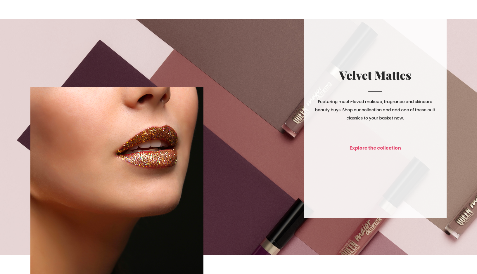
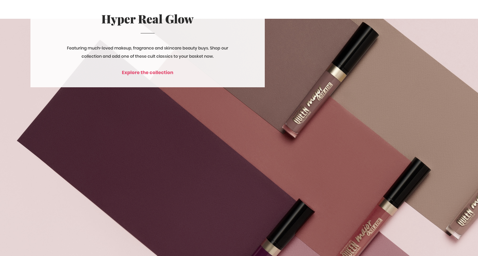
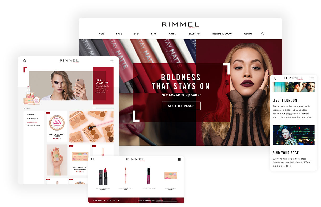
To differentiate this platform from competitors catering to a broader range of retailers, we focused on elevating beauty-specific features with granular levels of customisation, including multiple carousel styles suitable for beauty product recommendations; different methods of selecting colourways for lip, face, eye and nail products, colour styles for lip, face, eye and nail product swatches optimsed for each category, and 'how to apply' templates suitable for a variety of products, styles and looks.

To differentiate this platform from competitors catering to a broader range of retailers, we focused on elevating beauty-specific features with granular levels of customisation, including multiple carousel styles suitable for beauty product recommendations; different methods of selecting colourways for lip, face, eye and nail products, colour styles for lip, face, eye and nail product swatches optimsed for each category, and 'how to apply' templates suitable for a variety of products, styles and looks.

To differentiate this platform from competitors catering to a broader range of retailers, we focused on elevating beauty-specific features with granular levels of customisation, including multiple carousel styles suitable for beauty product recommendations; different methods of selecting colourways for lip, face, eye and nail products, colour styles for lip, face, eye and nail product swatches optimsed for each category, and 'how to apply' templates suitable for a variety of products, styles and looks.

To differentiate this platform from competitors catering to a broader range of retailers, we focused on elevating beauty-specific features with granular levels of customisation, including multiple carousel styles suitable for beauty product recommendations; different methods of selecting colourways for lip, face, eye and nail products, colour styles for lip, face, eye and nail product swatches optimsed for each category, and 'how to apply' templates suitable for a variety of products, styles and looks.

To differentiate this platform from competitors catering to a broader range of retailers, we focused on elevating beauty-specific features with granular levels of customisation, including multiple carousel styles suitable for beauty product recommendations; different methods of selecting colourways for lip, face, eye and nail products, colour styles for lip, face, eye and nail product swatches optimsed for each category, and 'how to apply' templates suitable for a variety of products, styles and looks.

rimmel-design

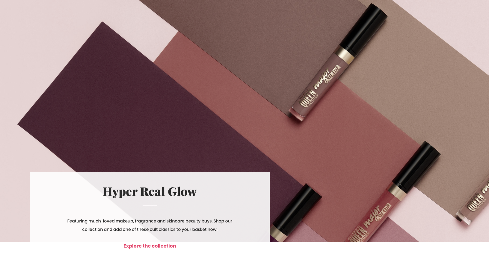
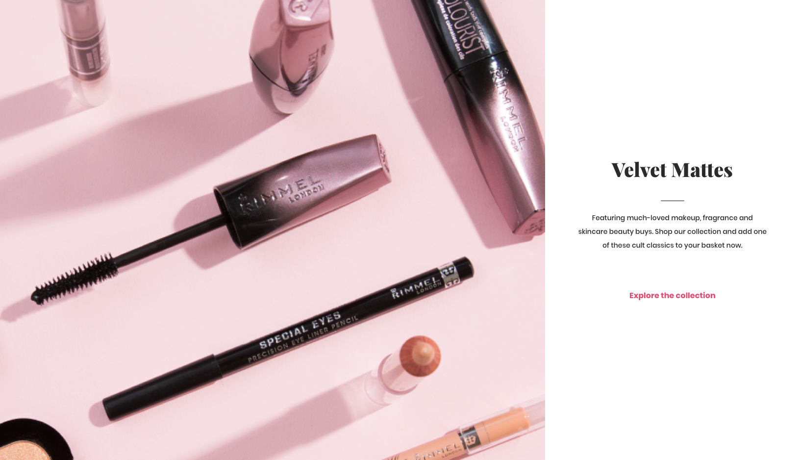
Image: Rimmel London site, using the CCX platofrm.

star-black

Visual Wireframing

Our team had found that using wireframes for user testing and presenting to clients had not been especially successful in communicating user journeys.

Rather than stripping out distracting content and encouraging focus, due to the visual nature of their industry, beauty brand marketing teams found it difficult to visualise how these grey boxes and blocky layouts would transform into their beautifully branded site.

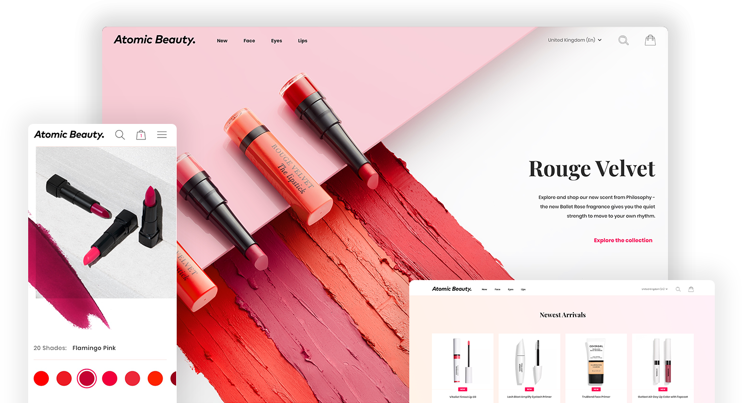
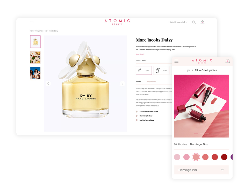
During in-person interviews users often complained that our low-fidelity prototypes didn’t match up to their expectations of a beauty site. To address this, we decided to create an in-house cosmetics brand, Atomic Beauty.

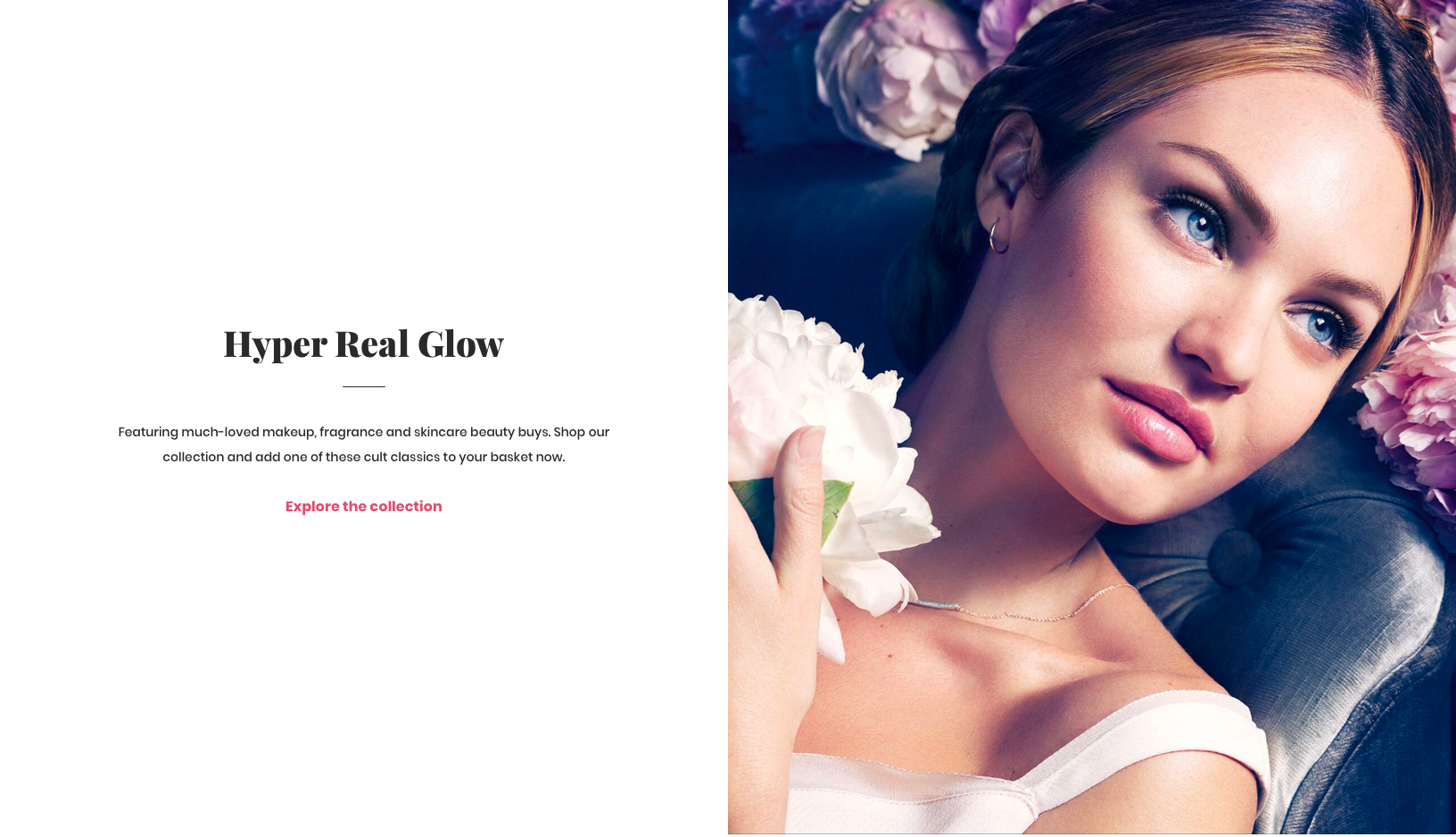
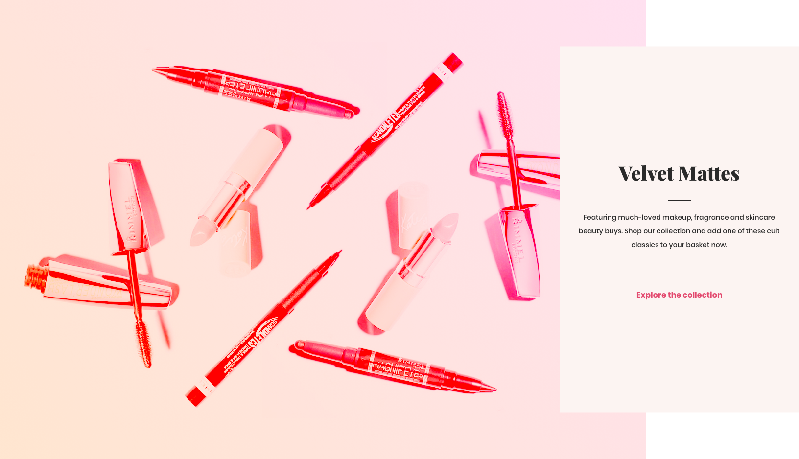
Beamly’s creative studio were able to provide a set of sample images, enabling us to both showcase the components in the best light, and provide guidance to brands on the types of assets required to achieve the same level of quality.

Component wireframing

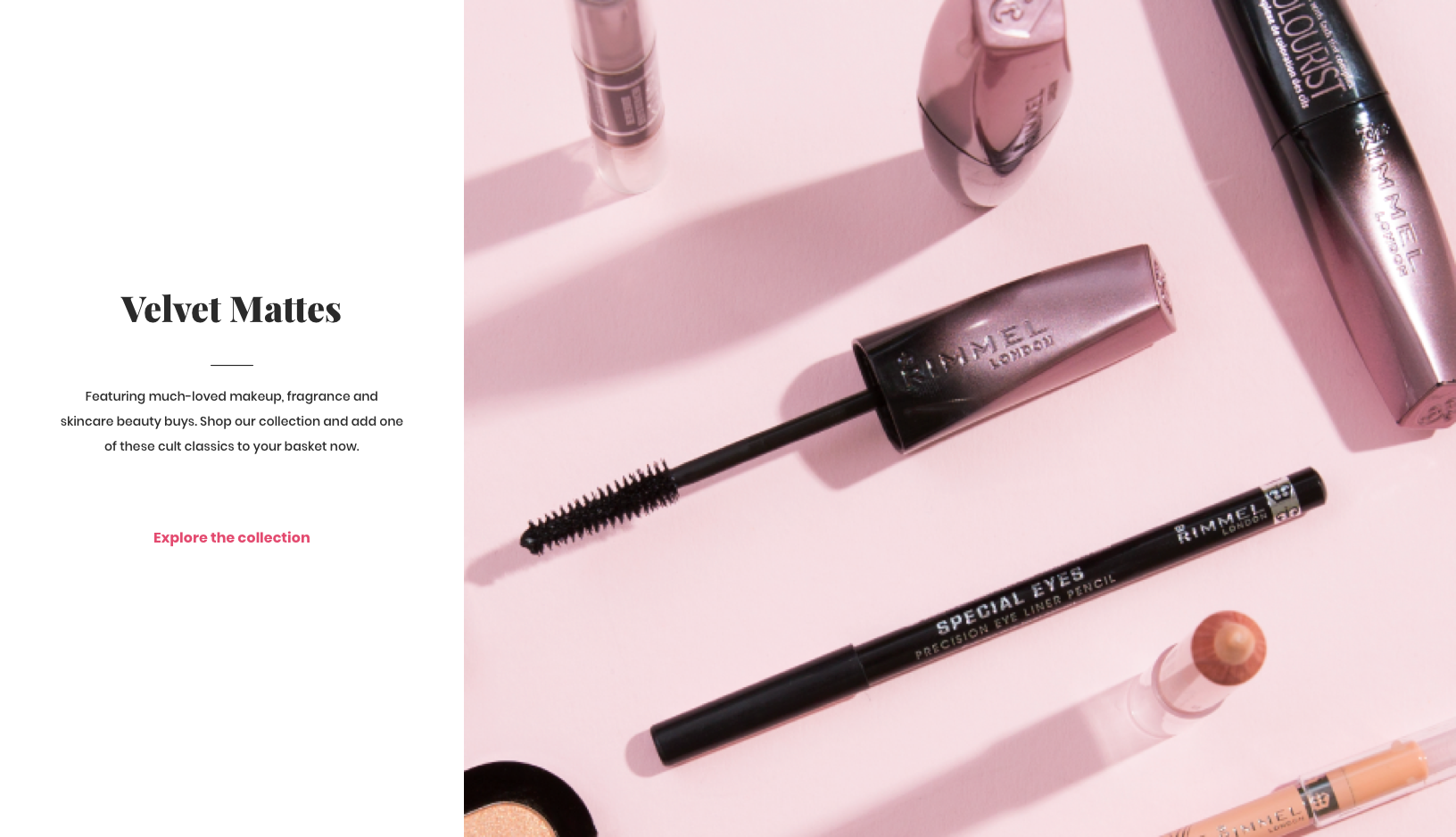
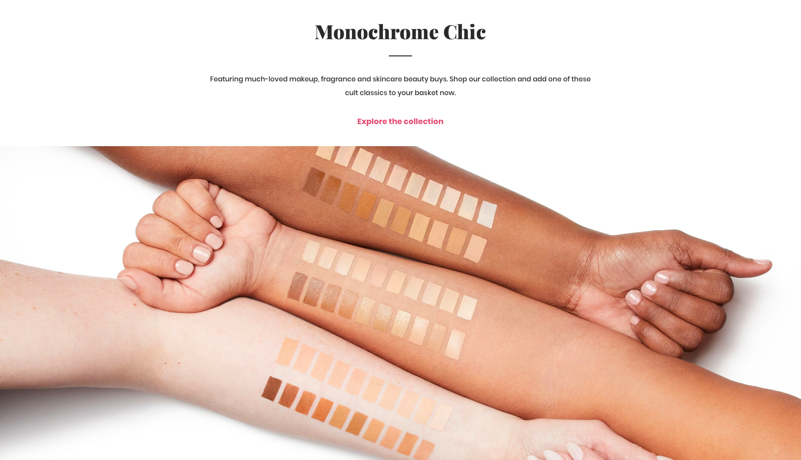
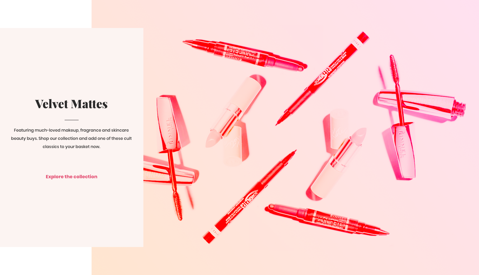
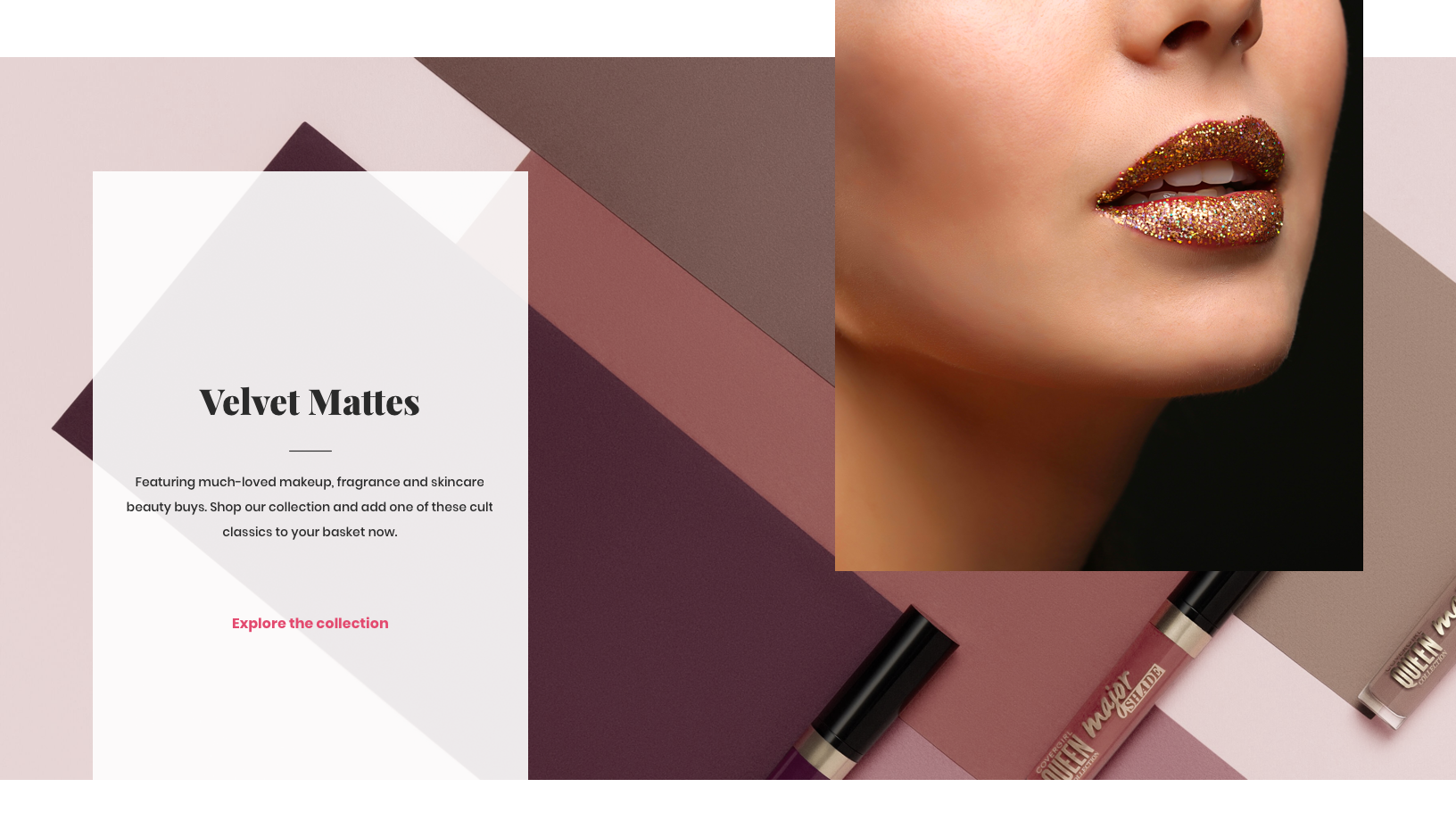
Images: Visual wireframing with Beamly creative studio images

star-black

Design System

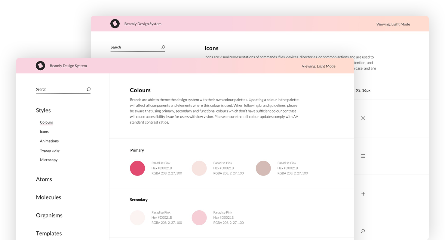
Each component was designed upwards from small building blocks, based on Atomic Design principles. When starting work on a new site, designers and developers receive a Sketch library of full web components, branding options and usage guidelines, a matching React library, and full documentation included in the accompanying design system.

Each component was designed upwards from small building blocks, based on Atomic Design principles. When starting work on a new site, designers and developers receive a Sketch library of full web components, branding options and usage guidelines, a matching React library, and full documentation included in the accompanying design system.

Each component was designed upwards from small building blocks, based on Atomic Design principles. When starting work on a new site, designers and developers receive a Sketch library of full web components, branding options and usage guidelines, a matching React library, and full documentation included in the accompanying design system.

Each component was designed upwards from small building blocks, based on Atomic Design principles. When starting work on a new site, designers and developers receive a Sketch library of full web components, branding options and usage guidelines, a matching React library, and full documentation included in the accompanying design system.

Each component was designed upwards from small building blocks, based on Atomic Design principles. When starting work on a new site, designers and developers receive a Sketch library of full web components, branding options and usage guidelines, a matching React library, and full documentation included in the accompanying design system.

This allows designers and developers to have a clear idea of where they can mix and match existing functionality, quickly answer questions, and help identify brand requests which would require additional development work. The design process, prototyping and development workflow can be sped up, whilst maintaining consistency and standards.

This allows designers and developers to have a clear idea of where they can mix and match existing functionality, quickly answer questions, and help identify brand requests which would require additional development work. The design process, prototyping and development workflow can be sped up, whilst maintaining consistency and standards.

This allows designers and developers to have a clear idea of where they can mix and match existing functionality, quickly answer questions, and help identify brand requests which would require additional development work. The design process, prototyping and development workflow can be sped up, whilst maintaining consistency and standards.

This allows designers and developers to have a clear idea of where they can mix and match existing functionality, quickly answer questions, and help identify brand requests which would require additional development work. The design process, prototyping and development workflow can be sped up, whilst maintaining consistency and standards.

This allows designers and developers to have a clear idea of where they can mix and match existing functionality, quickly answer questions, and help identify brand requests which would require additional development work. The design process, prototyping and development workflow can be sped up, whilst maintaining consistency and standards.

Design System

Shared design and development React component library

star-black

Animation and Interaction

One of the issues with highlighted by both designers and brands was that the existing sites felt too static. Even if transitions and animations were considered in the design phase, these were usually the first to be cut when defining the MVP.

For the CCX platform, animation and interaction were included in the acceptance criteria, and prioritised.

Our data showed that the login page was a common dropoff point. With most of the group’s site visitors being new rather than returning customers, it was important provide an onward journey if the customer was in a rush or hadn’t built up enough trust in the brand yet to part with their data. 

One of the issues with highlighted by both designers and brands was that the existing sites felt too static. Even if transitions and animations were considered in the design phase, these were usually the first to be cut when defining the MVP.

For the CCX platform, animation and interaction were included in the acceptance criteria, and prioritised.

Along with multiple component transition styles, we also included several families of responsive animated SVG icons, suitable for different brand tones of voice. These were available out-of-the-box, so even with the tightest deadline, the team could still ship a refined product.

Along with multiple component transition styles, we also included several families of responsive animated SVG icons, suitable for different brand tones of voice. These were available out-of-the-box, so even with the tightest deadline, the team could still ship a refined product.

Aiming to balance the business goals of increasing marketing reach and building up a single customer view with providing the user with a quick and easy way to check out, a small guest checkout link was added below the main call to action, along with copy to highlight the benefits of creating an account.

Along with multiple component transition styles, we also included several families of responsive animated SVG icons, suitable for different brand tones of voice. These were available out-of-the-box, so even with the tightest deadline, the team could still ship a refined product.

Along with multiple component transition styles, we also included several families of responsive animated SVG icons, suitable for different brand tones of voice. These were available out-of-the-box, so even with the tightest deadline, the team could still ship a refined product.

star-black

Content management

Due to the complex back-end setup of the sites' existing sites, brand marketing teams had to raise a development ticket to make any changes to the site, meaning that brands were unable to be reactive to current events or features in the press.

Due to the complex back-end setup of the sites' existing sites, brand marketing teams had to raise a development ticket to make any changes to the site, meaning that brands were unable to be reactive to current events or features in the press.

Due to the complex back-end setup of the sites' existing sites, brand marketing teams had to raise a development ticket to make any changes to the site, meaning that brands were unable to be reactive to current events or features in the press.

Due to the complex back-end setup of the sites' existing sites, brand marketing teams had to raise a development ticket to make any changes to the site, meaning that brands were unable to be reactive to current events or features in the press.

Due to the complex back-end setup of the sites' existing sites, brand marketing teams had to raise a development ticket to make any changes to the site, meaning that brands were unable to be reactive to current events or features in the press.

After researching and comparing several options, our team chose ContentStack as the content management system. The intuitive interface is ideal for use by editors with no coding experience, and as a headless CMS it was suitable for integration with the new React components and other Beamly products.

After researching and comparing several options, our team chose ContentStack as the content management system. The intuitive interface is ideal for use by editors with no coding experience, and as a headless CMS it was suitable for integration with the new React components and other Beamly products.

After researching and comparing several options, our team chose ContentStack as the content management system. The intuitive interface is ideal for use by editors with no coding experience, and as a headless CMS it was suitable for integration with the new React components and other Beamly products.

After researching and comparing several options, our team chose ContentStack as the content management system. The intuitive interface is ideal for use by editors with no coding experience, and as a headless CMS it was suitable for integration with the new React components and other Beamly products.

After researching and comparing several options, our team chose ContentStack as the content management system. The intuitive interface is ideal for use by editors with no coding experience, and as a headless CMS it was suitable for integration with the new React components and other Beamly products.

star-black

User testing and Validation

Fortnightly user testing sessions on the previous versions of components meant that we had a lot of data to work from. We continued testing all new iterations through in-person interviews or remotely, via Validately. 

Fortnightly user testing sessions on the previous versions of components meant that we had a lot of data to work from. We continued testing all new iterations through in-person interviews or remotely, via Validately. 

Fortnightly user testing sessions on the previous versions of components meant that we had a lot of data to work from. We continued testing all new iterations through in-person interviews or remotely, via Validately. 

Fortnightly user testing sessions on the previous versions of components meant that we had a lot of data to work from. We continued testing all new iterations through in-person interviews or remotely, via Validately. 

Fortnightly user testing sessions on the previous versions of components meant that we had a lot of data to work from. We continued testing all new iterations through in-person interviews or remotely, via Validately. 

As expected, certain variants performed better across different demographics, so we are able to advise brands on which to opt for. The components were also regularly presented to key stakeholders to ensure they meet business requirements.

As expected, certain variants performed better across different demographics, so we are able to advise brands on which to opt for. The components were also regularly presented to key stakeholders to ensure they meet business requirements.

As expected, certain variants performed better across different demographics, so we are able to advise brands on which to opt for. The components were also regularly presented to key stakeholders to ensure they meet business requirements.

As expected, certain variants performed better across different demographics, so we are able to advise brands on which to opt for. The components were also regularly presented to key stakeholders to ensure they meet business requirements.

As expected, certain variants performed better across different demographics, so we are able to advise brands on which to opt for. The components were also regularly presented to key stakeholders to ensure they meet business requirements.

Customisation Options

Constructing the preview

Constructing the preview

Customisation Options

Customisation Options

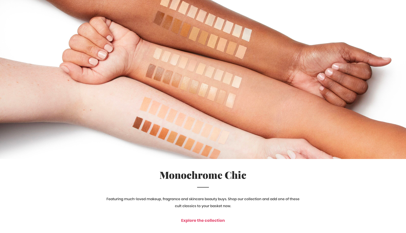
Several versions of each component were created to suit different brand styles, content needs and tones of voice.

star-black

Outcome and learnings

The final product included a a curated collection of easy to maintain, performant, accessible and reusable web components, available both as Sketch and React component libraries, along with full documentation.

When the platform was used to design the first site, the time taken to wireframe a ten-page template was reduced from one week to half a day.

Through improving communication, productivity and web standards, page build times were decreased by 75%, content publishing time by 50%, and load times by 65%.

Early feedback from content editors highlighted the improvements in speed and ease of publishing new assets, and product owners and designers reported that it’s much clearer which features can be offered to brands without extra customisation.

Project-Info-LightProject-Info-LightProject-Info-LightProject-Info-LightProject-Info-LightProject-Info-LightProject-Info-Light

Client

Coty

Bally, Belstaff, Jimmy Choo, Versace

Bally, Belstaff, Jimmy Choo, Versace

Coty

Coty

Agency

Beamly

Labelux

Labelux

Beamly

Beamly

Date

2018

2016

2016

2018

2018

My Role

Product definition and strategy
Stakeholder interviews
User and competitor research
Low-fidelity wireframes and prototypes
High-fidelity designs and asset creation
Usability testing and validation
Regular stakeholder presentations
Design workflow management
Providing direction to the design team

Discovery and research
Competitor analysis
Stakeholder presentations

Low-fidelity wireframes and prototypes
High-fidelity designs and asset creation
Usability testing and validation

Discovery and research
Competitor analysis
Stakeholder presentations

Low-fidelity wireframes and prototypes
High-fidelity designs and asset creation
Usability testing and validation

Product definition and strategy
Stakeholder interviews
User and competitor research
Low-fidelity wireframes and prototypes
High-fidelity designs and asset creation
Usability testing and validation
Regular stakeholder presentations
Design workflow management
Providing direction to the design team

Product definition and strategy
Stakeholder interviews
User and competitor research
Low-fidelity wireframes and prototypes
High-fidelity designs and asset creation
Usability testing and validation
Regular stakeholder presentations
Design workflow management
Providing direction to the design team

Collaborators

Beamly design and engineering teams
Coty brand marketing teams

Labelux design, production and engineering teams
Bally digital team
Belstaff digital team
Jimmy Choo digital team

Labelux design, production and engineering teams
Bally digital team
Belstaff digital team
Jimmy Choo digital team

Beamly design and engineering teams
Coty brand marketing teams

Beamly design and engineering teams
Coty brand marketing teams

Contact

star-white-1

Work Enquiries

Drop me an email to discuss your project

save for later

Design mentorship

© ZARA DREI 2024

Back to top Arrow
View